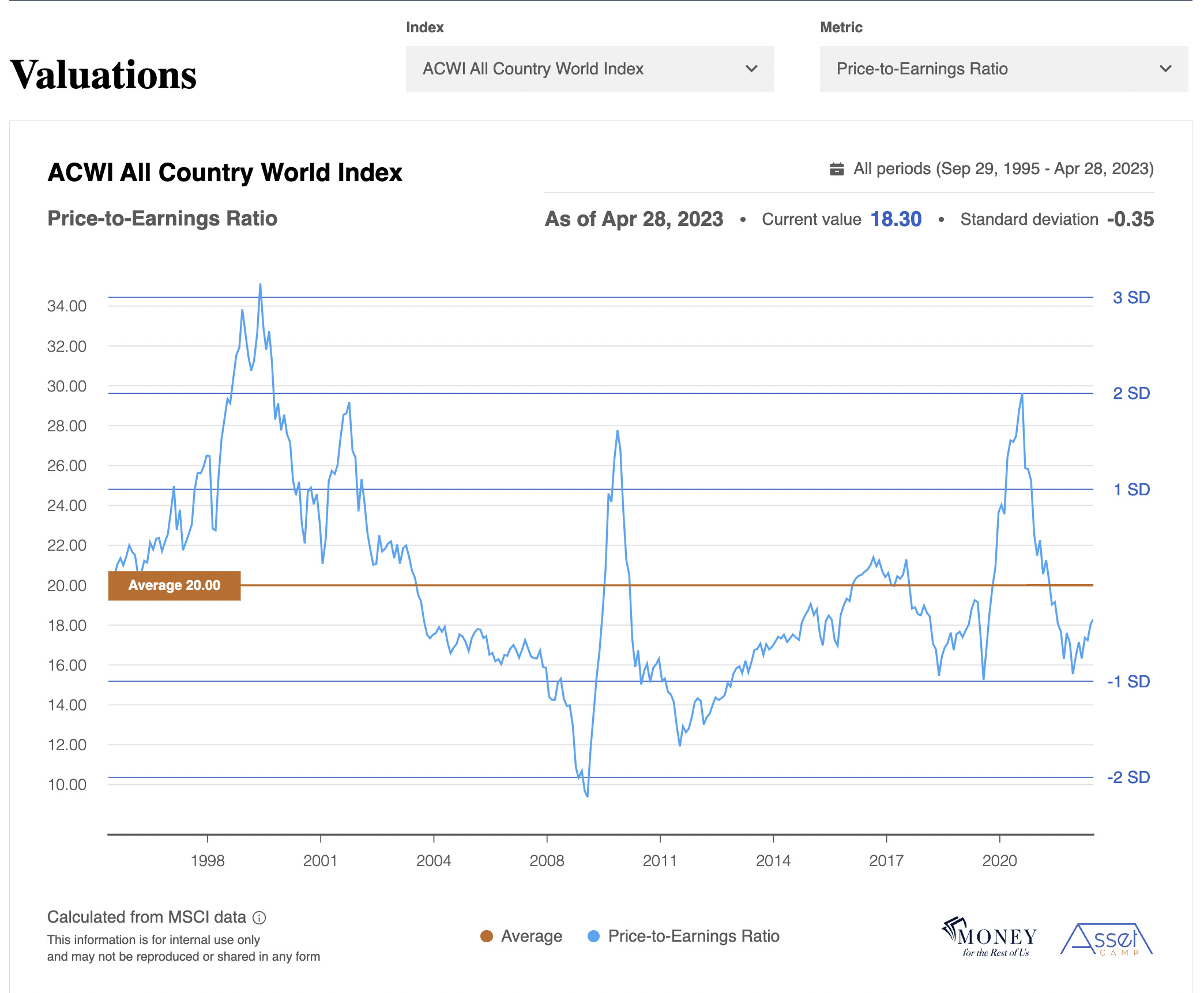
The reports are organized as charts with the name of the index and metric in the top left corner. For example, in the image above, the index is MSCI All Country World Index, and the metric is the price-to-earnings ratio.
The top right of the report contains the date range represented on the chart.
The date which represents the most recent data point can be found in the top middle of the chart. In the image above, the date is April 28, 2023.
The valuation and earnings reports update monthly, with the most recent date being the month’s last trading day.
Next to the date is the most recent value for the specific metric.
In the image, the current value for the price-to-earnings ratio for the MSCI All Country World Index is 18.30.
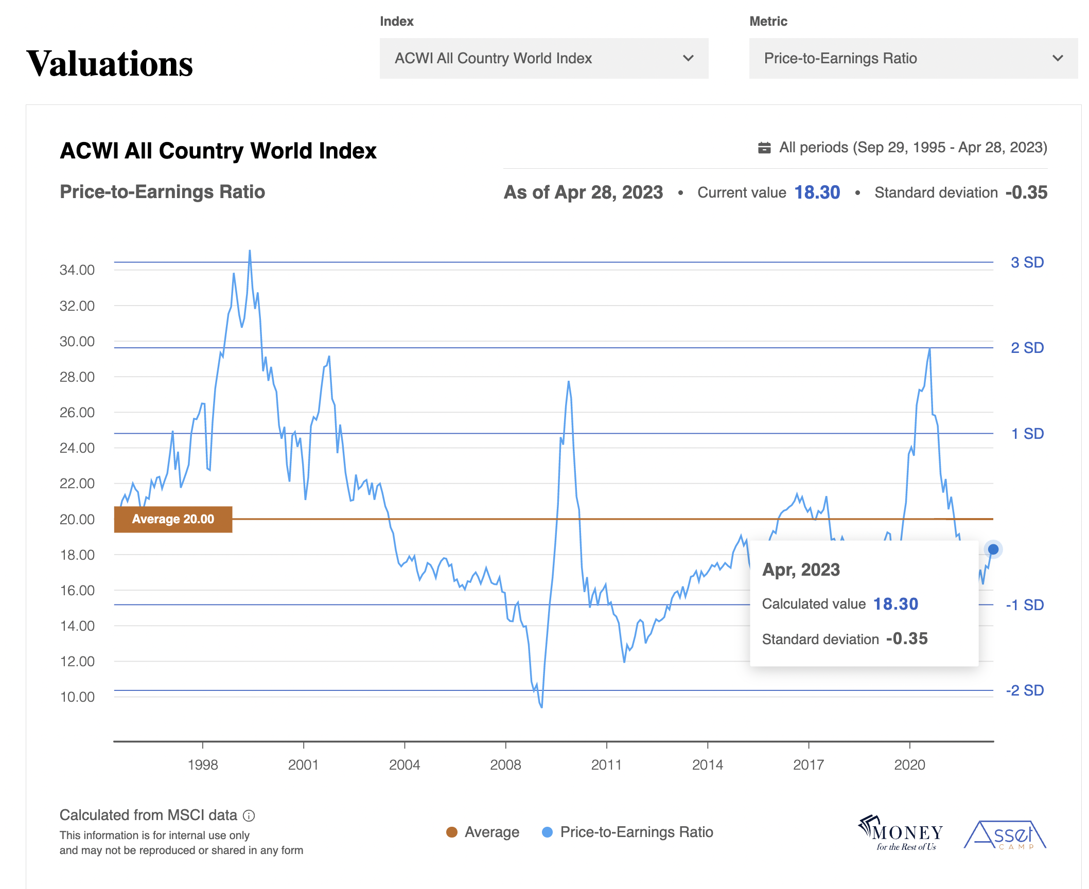
The current and historical values are represented by the blue line on the chart. You can see a box for the current and historical values by moving your cursor along the blue line.

Next to the current value at the top right of the chart is how many standard deviations the metric is from the long-term average.
The long-term average is represented by the orange line in the chart and its value is found in the orange box on the left side of the average line.
Standard Deviation #
Standard deviation measures the dispersion of the individual data points (e.g. monthly price-to-earnings ratio) relative to the average. The larger the standard deviation, the further the data point is from its long-term average.
If the standard deviation is a positive number, the data point is above the long-term average. If the standard deviation is a negative number, the data point is below the long-term average.
In the image above, the current P/E ratio of 18.30 is -0.35 standard deviations from the long-term average of 20.0. The standard deviation number is negative because the current value is below long-term average.
Current and historical standard deviations can be found by moving your cursor along the blue line.
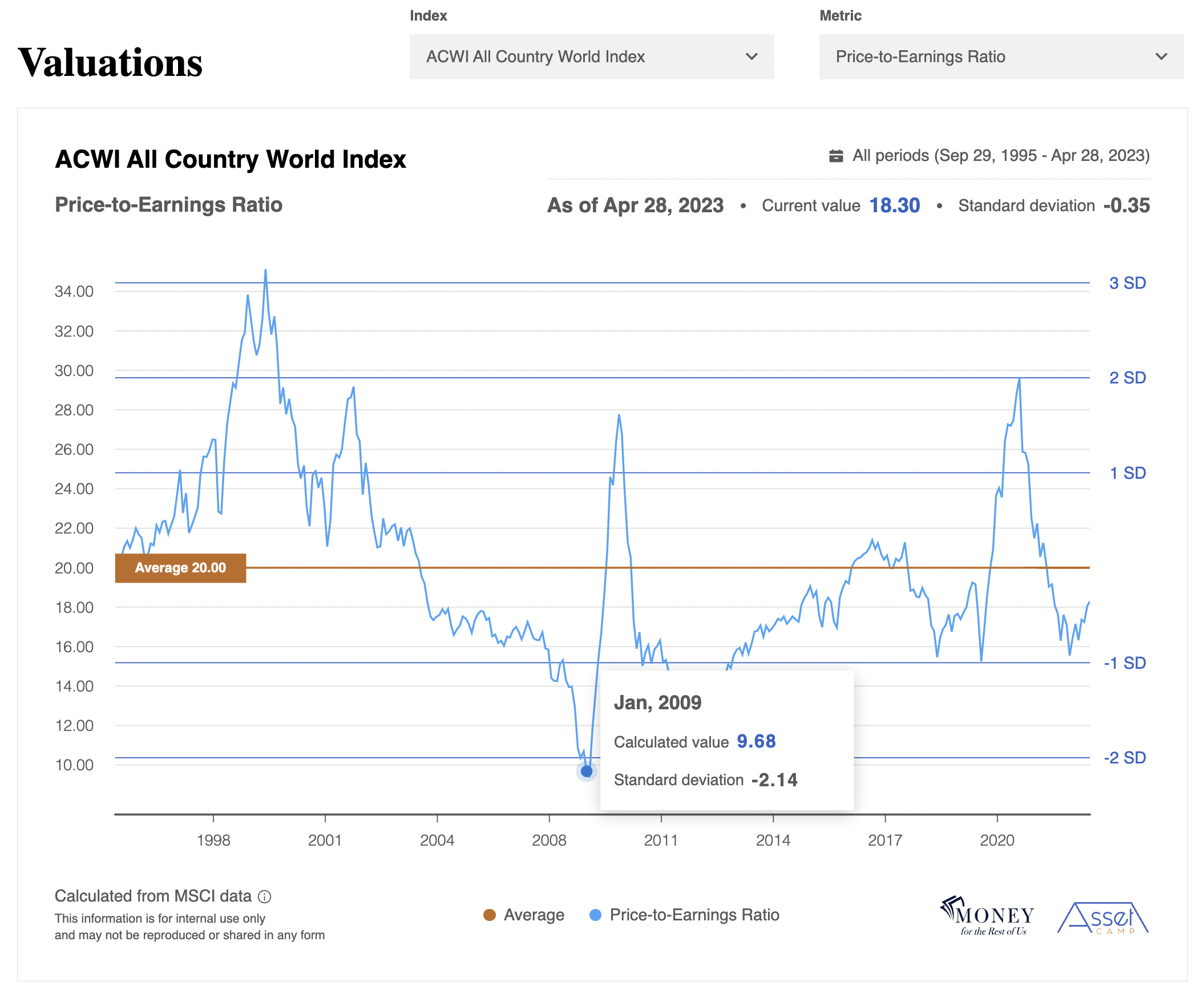
The darker blue horizontal lines on the chart represent standard deviations from average. 68% of the data points can be found within plus or minus one standard deviation. 97% of the data points are between +/- two standard deviations.
The standard deviation lines allow you to quickly see whether the current data point is over or undervalued relative to the average.

For example, in the image above, we moved the cursor to January 2009. At that time, the P/E ratio for the MSCI All Country World Index was 9.68. It was over 2 standard deviations below the average.
When the current data point is greater than one standard deviation above the average, that is generally considered to be overvalued.
When the current data point is greater than one standard deviation below the average, that is generally considered to be undervalued.
Data points that are more than two standard deviations above the average are considered extremely overvalued.
Data points that are more than two standard deviations below the average are considered extremely undervalued.
In our example, in January 2009, the MSCI All Country World Index was extremely undervalued as measured by the price-to-earnings ratio.


